Multiple brands and audiences
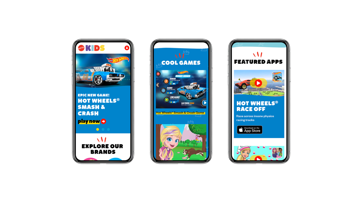
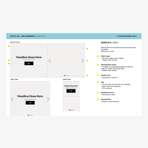
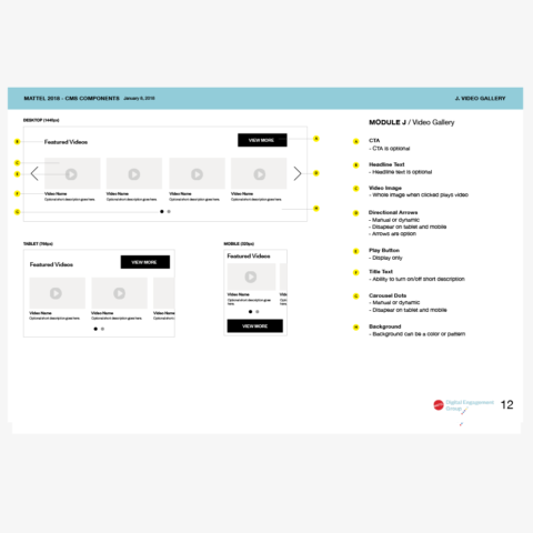
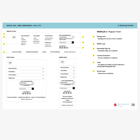
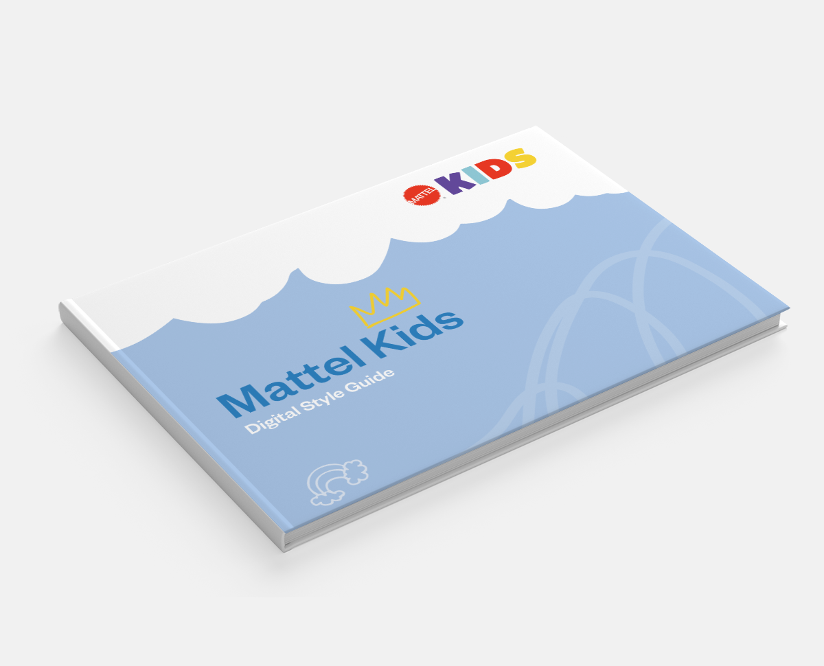
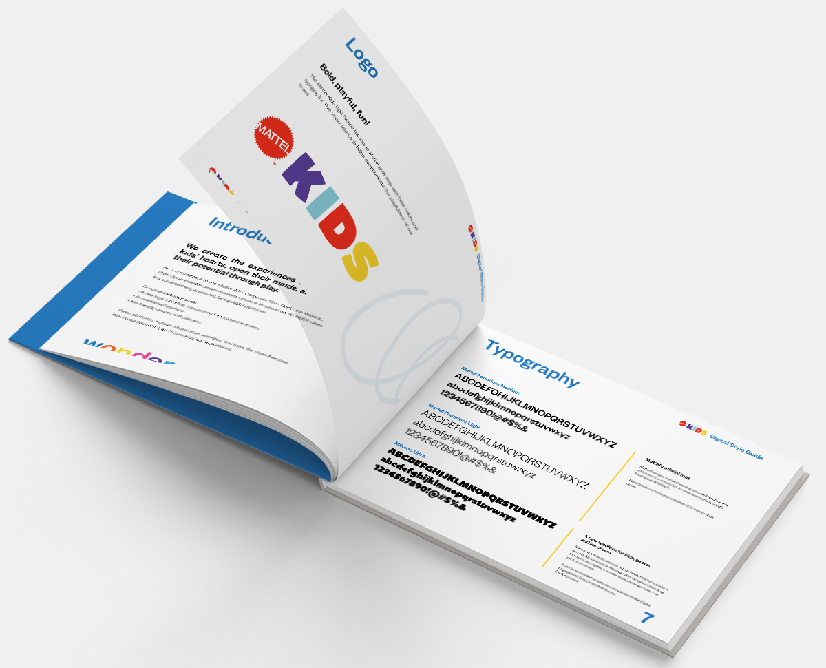
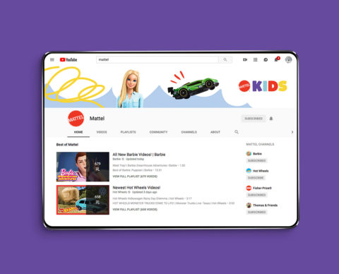
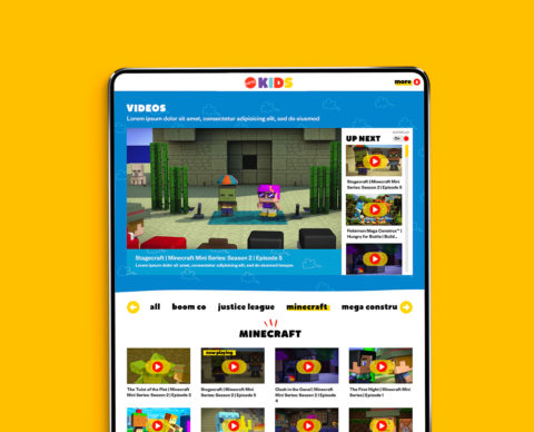
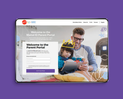
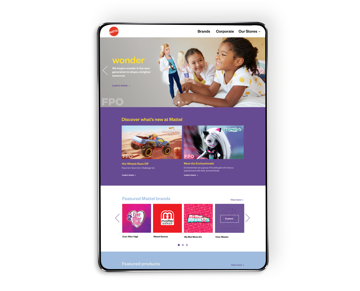
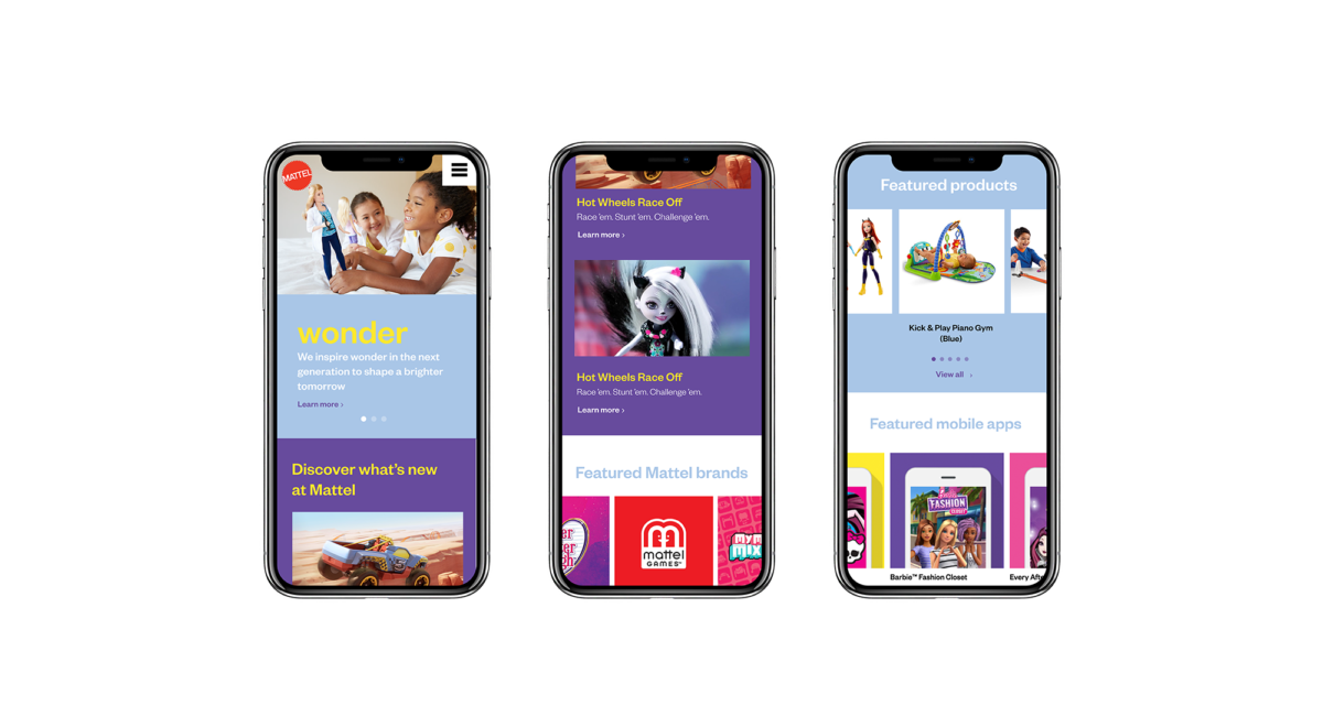
As part of an initiative to implement a new CMS on all of Mattel’s websites, our team created an extensive UX Strategy Plan, from competitive research and persona-definition (both kids and adults) to wireframing and site designs. We also designed and launched an interim site for Mattel.com and created the Mattel Kids Style Guide (including the logo) and executed it across multiple digital platforms.
Platforms
– Multiple websites under multiple CMSs’
– Facebook (video-first) content
– Instagram content
– SuperAwesome (A COPPA/GDPR compliant kid portal)
Skills
– Creative Direction
– UX Strategy
– Art Direction
– Web Design
Mattel Kids on Digital
Playful and fun
Evoking the playfulness and imagination of kids’ lives, the Mattel Kids brand style guidelines blend four vibrant Mattel signature colors in a fun and playful palette that aims to foster brand recognition and loyalty. New graphic components align with current design trends and create a memorable digital experience for kids.
